Web accessibility: RGAA and EAA compliance in 2026
The European Accessibility Act has been in force since 2025. Learn how to make your website RGAA and WCAG compliant to avoid penalties in 2026.
 Design · 3 min
In spring 2025, Airbnb launched a massive overhaul of its design system, along with a complete redesign of its mobile app. At first glance, you might think it was a cosmetic update, a simple interface refresh. But the reality runs much deeper.
This redesign is first and foremost a response to a strategic challenge: turning a single-product platform (home rentals) into a multi-offer platform capable of absorbing new uses. But it is also, and above all, a technical decision. Airbnb is reshuffling its design + front-end architecture to solve a problem many companies face without ever putting it into words: the growing complexity of developing and maintaining a fast-evolving digital product.
Historically, Airbnb was a platform connecting people around a single product: home rentals. Today, their vision goes much further. The app now covers multiple offers: accommodation, local experiences, services, itineraries.
It is a strategic transition toward a super-app for travel and local life. And this diversification requires a complete overhaul of the interface. Because a good design system is not just a component library: it is a visual and functional translation of the product strategy.
Behind this visual redesign, Airbnb tackled a problem well known to every tech team: design system debt and front-end debt.
Fragmented components, inconsistent interactions, difficulty iterating quickly... all symptoms of a system that no longer scales.
Without a deep overhaul, every new feature became a risk, every refactor a nightmare. A robust technical foundation was needed to restore the teams' velocity.
Airbnb therefore rebuilt its design system with a modular, shared and automated approach.
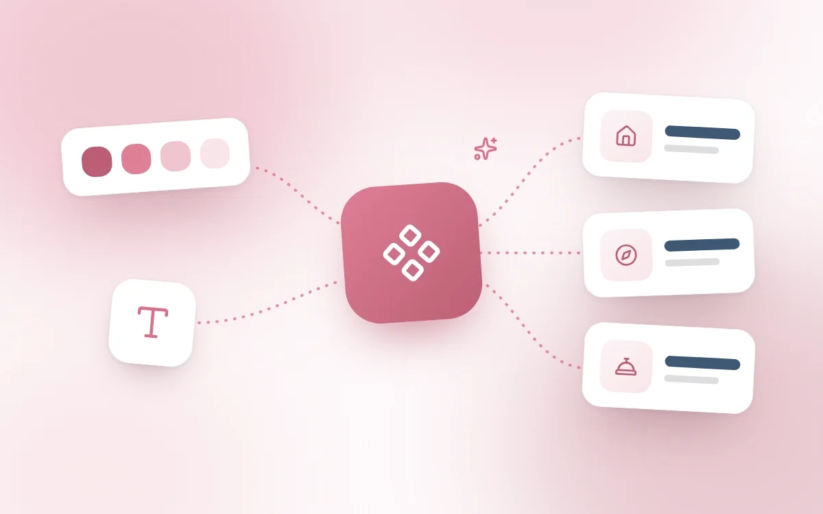
Design tokens: to centralize all visual variables (typography, colors, spacing).
Typed and documented components: in React, with strict typing, shared through internal libraries.
Figma <> code sync: to avoid any drift between design and implementation, and to smooth cross-team work with tools like Storybook or Figma Tokens.
Even if you do not have Airbnb's resources, you can draw on this approach to design or improve your business tools or your applications.
1. Stop piling on styles: build a system, not a patchwork.
2. Structure your components so they are reusable and documented.
3. Separate style, logic and data: to make scaling easier.
4. Automate visual testing and implementation: even in a simple way, it changes everything.
Airbnb's redesign is a success not because it is beautiful, but because it is structurally designed to support the product's growth.
A good design system is a development system hidden behind design. It is an infrastructure that makes it possible to scale, maintain and evolve a product quickly, while keeping underlying consistency.
At Fragments Studio, this is the philosophy we apply to every project. Whether it is an ERP, a business app, a SaaS platform or an e-commerce site, we do not design "a screen". We build a reliable, scalable and consistent system that is, above all, tailored to your needs.
And if you are wondering whether a design system always means saving time and boosting productivity, we took the time to break down that question in another article: Design system: productivity lever or complexity trap?
Follow Fragments Studio on Google
Add us to your preferred sources and our articles get surfaced first in Top Stories, AI Overviews and AI Mode.
 Design · 6 min
The European Accessibility Act has been in force since 2025. Learn how to make your website RGAA and WCAG compliant to avoid penalties in 2026.
 Design · 7 min
How to build a high-performing design system in 2026 without creating a bloated monster. A complete guide to tokens, Storybook and design governance.
 Design · 6 min
Transparency, error handling, human escalation, the right tone of voice: master the 7 rules for designing successful conversational AI interfaces.
Fragments Studio handles everything: from strategy to production.
Discuss my project